Wednesday 31 May 2017

Retail innovation

New Zealand retail's problems are deeper than a 15% GST-at-the-border levy. Here's what Amazon is doing. Marvel at the innovation.
This all said, I believe that Amazon is the most defensible company on earth, and we haven’t even begun to grasp the scale of its dominance over competitors. Amazon’s lead will only grow over the coming decade, and I don’t think there is much that any other retailer can do to stop it.

The reason isn’t the bullet-point moats that are talked about in headlines, and it isn’t the culture of innovation or Bezos’s vision as CEO (though I do think Amazon’s culture is incredible and Bezos is the most impressive CEO out there). It’s the fact that each piece of Amazon is being built with a service-oriented architecture, and Amazon is using that architecture to successively turn every single piece of the company into a separate platform — and thus opening each piece to outside competition.

I remember reading about the common pitfalls of vertically integrated companies when I was in school. While there are usually some compelling cost savings to be had from vertical integration (either through insourcing services or acquiring suppliers/customers), the increased margins typically evaporate over time as the “supplier” gets complacent with a captive, internal “customer.”

There are great examples of this in the automotive industry, where automakers have gone through alternating periods of supplier acquisitions and subsequent divestitures as component costs skyrocketed. Divisions get fat and inefficient without external competition. Attempts to mitigate this through competitive/external bid comparison, detailed cost accountings and quotas usually just lead to increased bureaucracy with little effect on actual cost structure.

The most obvious example of Amazon’s SOA structure is Amazon Web Services (Steve Yegge wrote a great rant about the beginnings of this back in 2011). Because of the timing of Amazon’s unparalleled scaling — hypergrowth in the early 2000s, before enterprise-class SaaS was widely available — Amazon had to build their own technology infrastructure. The financial genius of turning this infrastructure into an external product (AWS) has been well-covered — the windfalls have been enormous, to the tune of a $14 billion annual run rate. But the revenue bonanza is a footnote compared to the overlooked organizational insight that Amazon discovered: By carving out an operational piece of the company as a platform, they could future-proof the company against inefficiency and technological stagnation.
Read the whole thing. Amazon is amazing. There's a reason that you can parallel import things, as a consumer, for a much bigger price discount than the 15% GST gap.

I've been a skeptic about arguments for applying GST at the border, mostly because the main methods for doing so amount to non-tariff barriers: holding goods up at customs pending GST payment. I also think that if there's a distortion favouring imports because of the GST issue resulting in some allocative inefficiency, we should also consider that competitive pressure from those fringe parallel imports may make prices for domestic consumers more competitive as well.

But if Amazon does become increasingly dominant, that does simplify things a bit - if Amazon were willing to collect GST on its shipments to New Zealand.

Monday 29 May 2017

Health CPI

So Labour and National are scrapping over whether National's increased or decreased the health budget. There's no question that health budgets are well up since National took office, whether in per capita terms, real terms, nominal terms, or real per capita terms. Population's up about 10% since 2008; health budgets in CPI-adjusted terms are up about 29% since 2008. So real per capital spending has to be up.

But the more interesting question's on how to adjust health costs for CPI.

StatsNZ has a sub-index on health costs. And that's shown substantial cost inflation - well above CPI in some categories. But should health spending be adjusted for that sub-index? Let's look at what's in it.

Position in the CPI structure

The health group of the New Zealand Household Expenditure Classification represented 5.09 percent of the CPI at the June 2008 quarter.
Table 1
Expenditure weight for healthJune 2008 quarter
Group, subgroup, or classLevelWeight (percent)Examples of items within class
HealthGroup5.09
Medical products, appliances, and equipmentSubgroup0.98
Pharmaceutical productsClass0.61Prescription medicines, oral contraceptives, and over-the-counter products such as painkillers, cough and cold preparations, sunscreen, and vitamins
Other medical productsClass0.03Bandages and contraceptive supplies (other than oral contraceptives)
Therapeutic appliances and equipmentClass0.34Corrective glasses and contact lenses
Out-patient servicesSubgroup3.32
Medical servicesClass1.97General practitioner, specialist, and optometrist consultation services
Dental servicesClass0.94Dental examination, filling, and denture services
Paramedical servicesClass0.41Medical laboratory (eg scanning) services
Hospital servicesSubgroup0.78
Hospital servicesClass0.78Private hospital services
Let's assume that this is all still the same in terms of weightings and definitions as it was in 2008.

If you flip over to the figures, Infoshare has 2006Q2 as base set at 1000 for the level 2 subgroups. Medical products, appliances and equipment had dropped to 890 by 2008Q3 (National comes in) and is now at 1030. Basically, no inflation there. This group covers pharmaceuticals, medical products, supplies and equipment.

Out-patient services were at 1035 in 2008 and are now 1356. This covers things like GP fees, specialist fees, optometrist fees, dentist fees, and medical lab fees. It's mostly GP, specialist and optometrist fees. Suppose that the government wanted to concentrate health spending on lower income cohorts and so reduced the capitation fee paid to GPs while increasing the range and subsidy on the Community Services Card - with the whole thing being revenue neutral if clinics upped the GP consultation fee. That would increase measured out-patient service cost inflation but it would be silly to increase health budgets on the back of that inflation.

Similarly, if specialists decided to charge private clients more, that affects measured inflation but only affects government health provision costs if they also change how they bill DHBs.

Hospital services rose to 1187 by 2008 and to 1527 by 2017. This reflects costs at private hospitals. If richer people demanded nicer services at private hospitals that would show up as cost inflation but wouldn't affect costs at public hospitals - but could reflect that public hospitals are declining in quality of amenities relative to private ones.

Bottom line: the health component of the CPI has increased far more quickly than other parts of the CPI, driven by increases in private hospital costs and out-patient services. It's very likely that the cost of providing health services in the public system has outpaced CPI inflation, but I'd be reluctant to just use the health services subcomponent of CPI for a weighting there.

A few notes on the budget

Your take on last week's budget should depend on whether you have your economist glasses on, your politics glasses on, or your "economic policy is constrained by institutions and elections" glasses on.

The economics of it are pretty average.

The increase in the accommodation supplement is likely to flow through primarily to landlords. Radio NZ has reported on work at MSD showing relatively little effect of a prior increase in the accommodation supplement on rents, but the basic tax/subsidy incidence on this stuff depends on market conditions. If supply is more elastic than demand, meaning that a given increase in rent does more to stimulate new construction of rental properties than it does to decrease demand for rental accommodation, then the accommodation supplement is good for low-income tenants receiving it. If you run your study when regulatory barriers to building aren't as binding, you'll find that increases in charged rents are pretty minor. But if you extrapolate from that period to now, you just might be making a mistake.

I also worry that there's not been quite enough attention paid to the long term fiscal outlook, where the costs of an aging population drive us into substantial net debt from 2030; to effective marginal tax rates, which barely changed; or, to the small-scale fiscal discipline that would avoid cash giveaways to the film industry in favour of measures addressing either of the two prior points.

The changes to the tax thresholds only partially adjust for inflation since they were last changed in 2010. The increase in the threshold for the 17.5% rate overadjusts for inflation, but the 30% rate's threshold was underadjusted, and the 33% rate's threshold wasn't touched.

My piece at the Spinoff, last week, covered what would have been needed for inflation adjustment to those thresholds:
Suppose that the government adjusted the tax thresholds to account for wage inflation since 2010. The top income tax rate would then kick in around the $83,000 level, the 30% rate would come in at around $57,0000, the 17.5% rate would apply from about $17,000 and the bottom rate would apply below that. Treasury’s tax calculator says this would cut just under $1.9 billion from government revenues. For the same drop in government revenues, every tax rate could be cut by a percentage point and the 17.5% rate could drop by two points. Everyone would get to keep a greater fraction of the next dollar earned.
If we rank options, here's my preference ordering:

  • Adjust for inflation automatically by knocking income tax rates down by half a percentage point whenever accumulated wage inflation warrants it. Treasury's calculator provides the full-year costs of a one percentage point change in each of the tax rates. Whenever inflation gives the government an extra $740m in revenue through fiscal drag, cut each of the rates by a half point - at least on the current costings. 
    • Adjusting things this way means everyone sees a change in their marginal tax rate, with consequent dynamic benefits for growth. Adjusting the thresholds provides a big marginal tax change for a small group, and large inframarginal changes for everyone else.
  • Adjust for inflation automatically through annual changes to the tax brackets.
  • Let politicians pretend inflation adjustments are tax cuts in an election year. We're probably stuck with this one because politicians really really like being able to announce tax cuts in election years.
And that gets us to the pure politics lens, which has the budget as a triumph. That lens is boring and has been done to death already. 

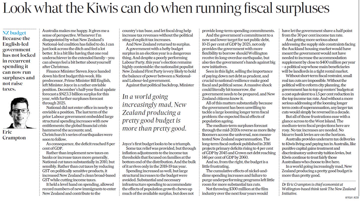
If we run it instead through a "what's the best we could have expected given that it's an election year and given the political constraints" lens, it's not too bad. Just consider how much better things are here than in Australia - the subject of my Australian Financial Review piece on the budget.


Saturday 27 May 2017

A better case for tipping

If New Zealand were to move towards a tipping norm, here's an entrepreneurial idea.

Set up a restaurant. The wait staff are all volunteers. They still have to pass through normal recruitment practices, but they're volunteers. List on the menu prices that there is no charge at all included in the prices for service: none. The wait staff receive no pay except that which is provided by diners as a gift, and list some suggested gratuity levels that would provide, if every diner paid those amounts, various wage levels from $15/hr to $30/hr.

Currently menu prices include not only the cost of wait staff but also the GST that applies on the service provided by the wait staff. My restaurant only charges GST on the non-waitstaff costs.

And restaurants normally have to compete for staff based on salary, but the gifts provided to my staff would all be before-tax. And since nobody's tracking how much the wait staff receive in donations, they'd be on their own recognisance when it came to things like income tax and ACC levies. Really, the tips are a gift, right? There's no gift duty in New Zealand (though I'm pretty sure IRD doesn't consider tips to be gifts).

I might change my mind about this whole tipping thing.

Friday 26 May 2017

Ending appeasement

Blackland's produced the best summary of the demise of the Wellington 7s that I've yet seen. Bottom line: the only outcome that would appease the critics was the death of the Sevens, so attempting appeasement was not a great strategy.

From their summary:
The organisers acquiesced to, and collaborated with, the “moral panic” (an imbalanced, hyper-sensitive reaction to non-extraordinary normal events) among the City establishment, including the Council and Police.

It was driven by non-attendees who disliked the behaviour, and campaigning media, but gathered strength when it was allied with anti-alcohol and social disorder sentiments. This gave moral imperative and opportunity which meant establishment and elite figures felt obliged to agree that “something must be done” to change the behaviour.

The changes made by the Sevens organisers and the City establishment directly affected the “party” atmosphere. This experience also relied on large crowds – the joint and mutually reinforcing experience. When attendance began to decline in response to the changes, it quickly gathered pace. Each fall affected the experience, which deterred future attendance.

The lesson is that acquiescence to value signalling of noisy people on contentious subjects can disadvantage those most important to your organisation or event; customers, staff or shareholders.

It is instructive that the Police finally praised crowd behaviour and declared themselves satisfied over the 2017 event, when effectively no one turned up and was a fiscal disaster.

The Police and the City establishment had killed a “golden goose” event enjoyed by tens of thousands of everyday New Zealanders, and the Sevens organisers collaborated.  
They conclude:
Conceding that there was a behaviour and alcohol problem tacitly accepted the need for curbs on these factors. That meant conspiring with the moral panic to suppress factors key to the event’s success. When they did, the event lost popularity.

Because the event was an alcohol-imbibing outrageous party, these factors would be a feature. If you remove these features, you remove the Party. You remove the party, you remove the event.

A common response recommended by public relations “experts” is to concede some ground – accept criticism and modify.

This was the first route tried by the organisers. It didn’t work. It accepted that alcohol consumption and behaviour was out of the ordinary and therefore a problem.

This emboldened and legitimised critics. Without the organisers’ backing, no one was standing up for the event’s punters.

Without any defence of the relatively innocuous and common standard of drinking and behaviour, the complaints were not challenged and moderated.

The next route was total collaboration with critics. The organisers introduced rules and components to the event pandered to the idea that it was possible to create a new product and attract new customers.

The critics had no skin in the event. The success or failure of the event would not be their responsibility, and would have no direct impact on them. Their objectives were different. They were motivated by factors such as changing alcohol consumption or attitudes, undermining rugby, signalling virtue to peers, or gaining political advantage or media airtime.
Read the whole thing, as well as their excellent recommendations that follow on from the conclusion.

HT: Stephen Franks.

Previously:

Product labelling

All we wanted was truth in labelling, backed by tough enforceable regulatory standards, right? Sounds good?

Here's where that path goes:
The fight over the US government’s definitions for certain foods has flared up again. It’s no longer just a fight for milk farmers, who’ve grown increasingly angry about plant-based food companies (think soy, almond, and cashews) calling their liquid products “milk.”

For the first time, vegetables are being roped into the debate—all because of the arrival and popularization of “cauliflower rice.”

“Only rice is rice, and calling ‘riced vegetables’ ‘rice,’ is misleading and confusing to consumers,” Betsy Ward, president of industry lobby USA Rice, said in a statement earlier this month. “We may be asking the Food and Drug Administration and other regulatory agencies to look at this.” Ward added that Scott Gottlieb, the new Trump-appointed FDA commissioner, could use his power to enforce the agency’s existing definitions for food, the so-called “standards of identity.”
The better system: a consumer guarantees act that guards against fraud, and a court system prepared to tell a plaintiff that he's an idiot for suing a riced vegetable producer for having a product that doesn't contain right (and award costs against him).

Thursday 25 May 2017

New EMTRs!

We have the new Effective Marginal Tax Schedules. Really these things should be published along with the budget documents.

The excellent Patrick Nolan will be presenting some work at the NZEA conference explaining New Zealand's EMTRs. They're kinda high in some income ranges.

I asked Patrick whether he might update one of the main scenarios (they all vary depending on number and ages of kids) to account for the newly announced income tax thresholds and WFF abatement rates. And he kindly provided! Thanks Patrick!

This scenario tracks the EMTR by weekly hours of work for a single-income family with an earner on $20/hour and with one child under the age of 16. I'll quote from the scenario description - note that the description is from the pre-budget version so make your own adjustments.

Again, the $14,000 threshold increases to $22,000; the $48,000 threshold increases to $52,000, the family tax credit increases by $9 per week and abates at a higher rate starting from a lower level of income. The accommodation supplement is not here included.

UPDATE: Updated 16.30 with a correction to the image from Patrick.


And here's Patrick (again: this is pre-changes):
Income taxes and ACC levies are levied from the first dollar of income. The starting tax rate is 10.5% and ACC levy is 1.4%, thus giving an initial EMTR of 11.9%.
 
Once gross earnings increase to $80 per week the main benefit starts abating. The net benefit abates at a rate of 70% against increases in gross non-benefit incomes. Income-tested benefits are not exempt income under section CW33 1(a) of the Income Tax Act 2007. Thus, as both the level of the benefit and total gross taxable income are above the threshold for the 17.5% tax rate ($14,000 per annum), the gross benefit abatement is 84.8% (given by 0.7 / (1 - 0.175)). The increase in gross income from a dollar earnings is thus 15.2 cents (given by 1 - 0.848), giving an increase in net incomes of 10.1 cents (given by 0.152 * (1 - 0.175) - 0.014), meaning an EMTR of 88.9% (given by 1 - 0.101).
 
The EMTR remains at this level until the gross benefit falls below $14,000, at which point the tax rate used to gross up the main benefit falls to 10.5%. Consequently the gross benefit abatement is 78.2% (given by 0.7 / (1 - 0.105)). The increase in gross income from a dollar earnings is thus 21.8 cents (given by 1 - 0.782), giving an increase in net incomes of 16.6 cents (given by 0.218 * (1 - 0.175) - 0.014), meaning an EMTR of 83.4% (given by 1 - 0.166).
 The EMTR and remains at this level until the person works 20 hours a week and thus qualifies for in-work assistance. The Minimum Family Tax Credit provides a guaranteed net family income, and so net income above the level of the guaranteed net income ($23,764) abates at 100% until the credit is fully exhausted. With the ACC levy this leads to an EMTR of 101.4%.
 Once the family has a net income before Working for Families of $23,764 the Minimum Family Tax Credit is fully abated, and the EMTR falls to 18.9%, reflecting the 17.5% income tax rate and 1.4% ACC levy.
 
Once gross income reaches $36,350 the rest of the Working for Families programmes start abating at a rate of 22.5%. The order of abatement is the Family Tax Credit and then the Working Tax Credit. (Note the Independent Earner Tax Credit and Parental Tax Credit are not included in this model.) This gives an EMTR of 41.4% (made up of 22.5% Working for Families Abatement, 17.5% income tax, and 1.4% ACC levy).
 
At $70,000 gross income the income tax rate increases to 33%, so the EMTR increases to 56.9%, and once the Working for Families entitlement is fully abated the EMTR falls to 34.4%, which is a combination of the top personal tax rate and the ACC levy. The EMTR remains at this rate until $122,063, at which point the ACC levy is no longer charged, and the EMTR is 33%.

Thanks again!

Previously: Bringing sexy back - EMTR style

Tax cuts require fiscal discipline

It's budget day here in New Zealand. Much has been pre-announced; Chris Keall has the summary list over at NBR. But as Rob Hosking points out, there's a pretty big remaining surplus that could yet give us some surprises. 

I'd expect most of those surprises to be saved for later election promises, but it would be nicer if they were laid out in the budget.

When it comes to tax cuts, though, we need to be careful. The surpluses look fine for the next few years, but current tax cuts would need to be reversed in a decade's time if we've neither sorted out the costs of an aging population (NZ Super, health), nor increased productivity and economic growth. And temporary tax cuts do less good than permanent ones.

I cover it off over at the Spinoff.
The case for more substantial tax cuts is sound, but harder. It requires the government to be willing to cut programmes that deliver little benefit. And while the government has taken a sharper eye on the effectiveness of new spending programmes under the social investment approach, too much spending simply carries over, year after year, with little attention paid to whether that spending achieves its objectives.

Interest-free student loans cost the government $600 million dollars per year and mostly benefits students who are either from wealthy families or who are likely to go on to be higher earners themselves. That’s more than what it would cost to cut the 17.5% income tax rate down to 16.5%.

Deciding not to throw $300 million at the film industry over the next four years would allow the government to cut the 30% rate down to 29.5%.

Every billion dollar programme throws away the chance to cut the 17.5% income tax rate to 15.5%.

But, even worse, while the medium-term forecasts are very rosy, with plenty of room for tax cuts, the longer-term projections have health care and superannuation costs requiring substantial tax increases or substantial spending cuts – unless somebody finds the magic formula to reverse the long-term slump in productivity.

Tipping

New Zealand has an excellent non-tipping equilibrium, but there's been some discussion of encouraging a shift to tipping. A lot of restaurants do kinda have it, mostly (I think) as a way of securing rents from foreign tourists who don't know better.

But most of the discussion around tipping has the base economics of the thing wrong. The main point of tipping is to solve an information asymmetry problem.

Suppose you own a restaurant and simply have no way of telling which of your wait staff are decent with the customers and which are terrible. In that state of the world, you pay them a low hourly wage and encourage the customers to top it up based on the quality of service. Ideally this means that bad wait staff get no tips and exit the industry, average service gets an average overall wage inclusive of tips, and excellent staff are appropriately compensated.

In practice, shame constrains customers against leaving meagre tips for poor service, and tipping makes splitting bills among groups a hassle. And is it really that hard for a restaurant owner to tell whether the wait staff are doing their jobs properly?

Also worth noting is that service staff in roles with tipping have lower minimum wages in the US. Wages plus tips in total have to equal the minimum wage in some states; others just have a really low minimum wage for tipped staff. New Zealand's minimum wage is already very high relative to prevailing wages, and restaurant meals here are not cheap. Combining a high minimum wage with a shift to a tipping norm would have effects on overall demand for restaurant meals.

Finally, and from a more Eric-preferences perspective, it's just really really nice to have the staffing costs bundled into the price of everything and not have to carry a wad of small bills around to pay the same amount for your meal at the end of the night. And I don't particularly like what tipping does to service in the US - because I'm idiosyncratic. On average, people give higher tips where the server is chatty and, if the server is female, touches the customers. I don't like any of that.

Previously: Tipping and inflation incidence

Wednesday 24 May 2017

Net Fiscal Impact - disaggregated

Keith Ng's 'mythbusting' around net taxpaying annoyed me enough that I started digging around for more of the literature on this stuff. 

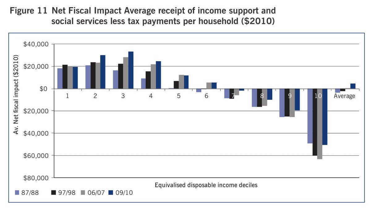
Keith argued that it's a myth that 40% of households pay no net taxes. While he's right that the commonly cited measure just focuses on income taxes paid versus cash transfers received, it isn't like correcting for that shows the system is less progressive or relies less heavily on the top deciles' tax contribution. When Aziz et al had a look, they found this:

The figure shows the cost of transfers and services provided to households in each income decile, net of the taxes paid by households in that decile. It includes all taxes, even GST. And when you look at it that way, the bottom four deciles receive substantial transfers, the middle three deciles net out close(ish) to even, and the top three deciles pay rather more in tax than the value of the services they receive. Or, put another way, the bottom six deciles receive more in transfers and services than they pay in tax, the seventh decile is tiny net tax contributor, and the top deciles contribute substantially. 

That should have been common knowledge among folks dealing with data, inequality, and tax. We even included the graph in our report on inequality.

What we didn't include, and I only recently had pointed to me, was the life-cycle and gender effect. Life cycle of course matters: government spends far more on kids than it receives in taxes from kids, and same for the elderly. Much of tax and transfer policy handles life-cycle income smoothing that would otherwise be generally handled by households on their own.

But I hadn't known the size of the gender gap. There had to be one, since men's earnings are higher than women's earnings; women live longer and then collect superannuation over a longer period; and, health care costs are higher for women. Even still, I was surprised. I hadn't known about the gender gap in education costs, for example. 

Regions above the $0 line x-axis are cohorts that, on average, are paying more in tax than they are receiving in transfers and in services (valued at cost). They write:
The data illustrated in the figure suggest that, on average, males start having a positive net fiscal impact—per capita tax revenue exceeds the (allocated) expenditure they receive—in their early 20s. Women, on average, do not pass this “break even” point until their mid-40s. This is due to a combination of lower workforce participation, higher health and education spending, higher income support, and lower direct and indirect taxation.

A possible causal link may lie behind the high value of per capita education expenditure observed for women aged 30–44 and the lagged increase in per capita market income and direct tax for females in the 45–49 year age group. One possible hypothesis is that retraining during child-rearing years that precedes re-entry to the labor market results in an increase in market income and consequently higher direct taxation. The net effect of decreased education expenditure and increased direct taxation increases the net fiscal contribution of women in the 45–49 year old age group.
If we consider only the age patterning, this looks like what households and individuals would be doing for themselves absent the state. You consume less than you earn during your prime earning years in order to provide transfers to your children and to save for your retirement.

There's a similar aspect to the gender patterning where it is more common for males to be the primary earner. In households with a male primary earner and a female who takes a longer period out of work or in part-time work to be able to spend time in the home, you'd see males consuming less than they earn in the market and females consuming more than their market earnings. Were there no government-provided healthcare, taxes would be lower and families would purchase their own health insurance - which would have a similar 'net contribution' breakdown were anyone so daft as to try to produce that figure within a household.

This side of things didn't come in at all for the piece I wrote for the Dom Post on it, as it's largely irrelevant to the argument about household-level net tax contributions. But it's interesting and I hadn't known it before.

Thanks to John Creedy for the pointer.

Also: Fairfax produced this very nice infographic version of the Aziz et al figure. Excellent!

CPS and the Marial Boatlift

George Borjas and Michael Clemens have been arguing about the effects of the Marial Boatlift. What happened to the wages of prior Miami residents when 125,000 Cuban low-skilled refugees showed up over a short period? 

Early work by David Card showed no effects on wages. Borjas more recently claimed negative effects on the wages of high-school drop-outs.

Here's Clemens:
But it was in that act of slicing the data that the spurious result was generated. It created data samples that, exactly in 1980, suddenly included far more low-wage black males—accounting for the whole wage decline in those samples relative to other cities. Understanding how that happened requires understanding the raw data.

Both the Card and Borjas papers use data from the Current Population Survey or CPS, a representative sample survey of U.S. workers. This survey happens every month; it’s where we get the estimates for the U.S. unemployment rate. Two datasets taken from the CPS also report workers’ wages. These two datasets are called the ‘March Supplement’ and the ‘Outgoing Rotation Group’ (ORG). These aren’t surveys of all workers, but of a small number of workers chosen randomly from within subsets of the population, so that their answers to questions about wages will be representative of the wages of others like them.

Right in 1980, the Census Bureau—which ran the CPS surveys—improved its survey methods to cover more low-skill black men. The 1970 census and again the 1980 census had greatly undercounted low-skill black men, both by failing to identify their residences and by failing to sufficiently probe survey respondents about marginal or itinerant household members. There was massive legislative and judicial pressure to count blacks better, particularly in Miami. Starting in the 1981 CPS, survey coverage of lower-skill black men shifted sharply to include relatively more black men with less-than-high-school, and relatively fewer black men who had completed high school.
Upshot: Miami started including in its sample a pile of black men with less-than-high-school education who should have been in the prior surveys, but weren't, at the same time as the Marial boatlift. Where other work pooled those with high school education and those with less than high school, this effect didn't matter so much because the change in population composition was small. But when you drill it down to the cohort of high school dropouts, the composition effect mattered and drove the Borjas results.
What I’m discussing here is just one of many ways that this change in the composition of the survey sample can explain discrepancies between earlier studies of the Boatlift. One of these is that a study by Giovanni Peri and Vasil Yasenov of U.C. Davis showed that the results in the Borjas study are sensitive to which dataset one uses. I mentioned above that the CPS has two wage surveys each year. The above graphs are for the March CPS that the Card paper used, and Borjas’s paper focuses on. Peri and Yasenov showed that the result is much smaller in the other wage survey (the ‘ORG’ survey), a result that is discussed in revised versions of the Borjas study. Specifically, the wage effect estimate in the Borjas study is three times larger in the March CPS survey data than it is in the ORG data. There is no clear reason why the true effect of an immigration wave would change that much between two different surveys. But our paper has a simple and definitive explanation for this result: the post-1980 increase in coverage of low-wage blacks is three times larger in the March CPS than in the ORG data. The glove fits, in this way and several others that we discuss in our paper.
Clemens concludes:
The evidence from the Mariel Boatlift remains as found in David Card’s seminal research: there is no evidence that wages fell, or unemployment rose, among the least-skilled workers in Miami even after a sudden refugee wave raised the size of that workforce by 20%.

This does not by any means imply that large waves of low-skill immigration do not or could not displace any native workers, especially in the short term. But facile pronouncements in recent statements by politicians, that immigrants necessarily do harm native workers, must grapple with rigorously-studied real-world experiences to the contrary. The Mariel Boatlift remains one of the most enlightening experiences of this kind.
Update: Borjas responds to Clemens here, noting that if he re-runs things pulling blacks from the sample, it doesn't affect his results. Clemens replies that there are only 3 non-blacks in the sample in one of the important years, and that regressions relying on three observations aren't really reliable.

Tuesday 23 May 2017

Asset sales and infrastructure funding

Christchurch's refusal to sell the Port during earthquake reconstruction was ridiculous. The city needed a pile of money for new infrastructure to cover uninsured losses. The Port had just received a giant insurance payout that, in some views, covered the harms of decades of deferred maintenance. There would never be a better time to sell the port than when it was set to be all fresh and shiny, before the next decades of deferred maintenance did their work.

Instead we had talk about not selling the family silver. Know when it's time to sell the family silver? When you need to rebuild the house because of a big stupid earthquake.

Auckland's position on asset sales hasn't been much different. Auckland needs a pile of new infrastructure to let it fund its continued growth. But it faces a strange debt constraint: rules on how much interest Council can pay as a fraction of its tax revenue. Debt-funded infrastructure then needs very quickly to provide a return well in excess of the debt's interest cost. Laying out trunk infrastructure with a century's lifespan that enables growth more than repaying the investment 10 years out doesn't work if it has to pay for itself faster than that. And that's part of the current mess.

Asset sales can then help. I covered it in last week's Insights newsletter. Subscribe at the link (it's free).
The macroeconomic effects of Auckland’s housing crisis are felt throughout the country. If Auckland could better accommodate growth, central government would reap the resulting income tax and GST revenues.

Immigrants pay more in tax, on average, than they receive in government services – but those estimates do not include the infrastructure costs that fall on local government. If Auckland’s infrastructure mess forces central government to close the door on immigration, that could easily be to the long-term detriment of central government finances.

But councils coming cap-in-hand to central government for help face a fair bit of scepticism for the simple reason that councils have not been making some of the harder choices necessary to finance their own growth.

During the Christchurch earthquake recovery, some of Christchurch City Council’s pleas for more central government funding rang a bit hollow. National campaigned in 2011 on a programme including partial privatisation of state-owned enterprises to help fund other programmes. Meanwhile, Christchurch Council refused to consider privatisation of Lyttelton Port of Christchurch or a host of other Council-owned assets.

From a central government perspective, some of the calls for help sounded a bit like your kid asking for financial help while refusing to replace his flashy car with a more thrifty model – after you have already traded yours in.

Phil Goff’s willingness to consider partial privatisation of the Ports of Auckland is then a very welcome first step. But Auckland Council could be bolder. The land under Auckland Council’s golf courses alone is worth over a billion dollars. Selling that land for housing development would not just provide more houses. It would also provide funds to service further intensification and further greenfield development.

And if Auckland were doing its share, we would hope that central government might consider doing its bit as well by passing on some of the benefits it receives from a thriving Auckland.

Monday 22 May 2017

Regulatory incidence and housing

Knowing a bit about tax incidence is useful if you want to be able to figure out what policies might help with Auckland's housing affordability issues. Here's me in last week's NBR:

Auckland’s housing markets are a mess but they are not the hell of perfectly inelastic supply. The burden of taxes and regulation in housing markets are shared between buyer and seller. If we expect that housing will become relatively more elastic as the unitary plan takes effect and as central government policy around infrastructure improves, then effects of other policies change.

Measures like rental warrants of fitness could actually provide net benefits to tenants – if we do not expect supply conditions to improve. But as soon as regulations around housing and infrastructure shift to allow more supply, then those same rules flip to making tenants worse off.

When supply is working properly, tenants sort into the quality and price tier that best suits their preferences and budgets. Rental warrants of fitness then at best compel landlords to provide what tenants were already demonstrating that they wanted, and at worst make rental accommodation too expensive for some tenants.

And so politics makes for strange policy bundles.

Labour proposes fixing regulation so that more housing can be built: abolishing the rural-urban boundary and improving infrastructure financing. But Labour’s promised Healthy Homes Guarantee makes the most sense if housing supply issues are not addressed. And if zoning and infrastructure are sorted out, there is little need for the government to be directly involved in building more houses.

Meanwhile, National has spent the past nine years avoiding fixing the underlying urban planning and infrastructure financing problems. It has blamed coalition politics but has remarkably managed to fail to take up those opportunities that have arisen.

Its general preference to avoid undue intervention into rental markets should really be coupled with policies that would allow new development.

Tax incidence can yield counterintuitive conclusions about who benefits from policy. A simpler question for voters to ask: will this policy make it easier for new housing to be built? If it does, then builders could get on with the important task of exercising their comparative advantage: easing the housing shortage.
Do subscribe, but you can read the whole thing here.

Thursday 18 May 2017

Coming to the nuisance

I simply don't understand the mentality that leads people to move next door to music venues then push Council to shut them down. Even more baffling is why we have developed institutional arrangements that give every jerk a veto right.

Just read it and weep.
The Barrytown Hall - a popular venue for New Zealand music for at least 40 years - has been shut down after a noise complaint from a neighbour.

The rural village hall is well known on the New Zealand and international music circuit as an alternative live music venue.

Hall committee chairman Roger Ewer said because of one complaint the committee was now having to jump through hoops to resume staging live performances.

It has already cancelled gigs through until at least August, including the latest Arts on Tour offerings, which incurred a $1000 financial penalty for cancellation.

"It's ridiculous. One person can do this. We've got one person able to complain to stuff things up," Mr Ewer said today.

"It is very frustrating when I've been involved in these types of things since 1972 and there's never been a problem."

When the hall began to host live music the surrounding environment was totally rural.

He said the noise complainant was a relatively recent arrival in Barrytown, living in one of the former railway houses that were shifted from Otira to a site opposite the hall about 18 years ago.
This is what you get when you abandon common law coming to the nuisance principles in favour of a stupid Resource Management Act.

It gets worse.
The hall committee had considered a legal challenge but decided instead to work with the council.

"They seem to be quite responsive about helping us through it. We've gone along with their requests rather than fighting it legally, which we could have done."

They had been working on the basis of "existing use rights".

"It's interesting. It's turned out that they can impose a residential noise limit on us after 9 o'clock at night, which is ridiculously low."

Mr Ewer said the hall had now applied to adjust the decibel level in its consent.

Two affected residents opposite the hall had assented to the hall's application.

Another two households had declined and the hall also had to get sign off from absentee property owners.

"It's really stuffed things up and is losing us a lot of money."
Folks who put houses next to an existing music hall, or who move into them, should not have standing to complain about noisy music.

If we're moving towards increased intensification in urban areas, we likely need to get existing neighbours' use rights written down in the LIMs for the surrounding area - both so that buyers have no way of pretending that they didn't know that they were moving next to a bar or music venue, and to diminish their standing to complain about things that predated their move.

HT: Darian Woods, who notes that he had a great time performing there in 2008. Pity the fool who complains about hearing this from next door.

Monday 15 May 2017

Uber Me

Morgan Tait has a great writeup at Newsroom on Uber's third (NZ) birthday. She includes a couple of bits from me.
Dr Crampton said Uber was ultimately an example of how new technology and business models could very quickly show gaps between the intent of a law and its seemingly outdated execution.

“They want a level playing field, the taxi industry is saying everyone should have the same rules but we need to step back and look at what the purpose of those rules are.

“The existing sets of taxicab regulations, the point of them is to make sure people are comfortable and safe getting from A to B.

“A lot of the things that the regulations are trying to achieve are already being achieved by the Uber app.

“So you have to think, should a level playing field be in terms of regulation or be a standard that the regulation should bring everyone up to?”
I'd hit on a couple of related themes over in our Insights newsletter recently:
I’m a fan of classic episodes of The Simpsons. In Cape Feare, Sideshow Bob sneaks a ride under the Simpsons’ car, with murderous intent. After an unpleasant ride, he steps out from under the car, and onto a rake. And onto another. Every time a rake hit him in the face, it got just a little bit funnier.

Watching the Transport Select Committee’s handling of Uber is funny too, but not ha-ha funny.

Back in November, Uber faced the Transport Select Committee. They should have had a lot to talk about. A lot of the rules around taxis are there to solve problems that really do not come up with app-based systems – and impose a lot of costs at the same time. Working through those details would have been a pretty worthwhile use of the Committee’s time.

Instead, the Committee seemed baffled by even the simplest details of how Uber works. They wanted assurances that Uber would not be picking up passengers trying to hail cabs at taxi stands. Uber’s Richard Menzies had to explain, over and over again, that their cars can only be booked through their app.

The government took some well-deserved rakes to the face from the press after that debacle, with the Transport Minister having to defend his “clueless” committee.

Maybe you’re an optimist and thought they’d have learned from that. And maybe you’d have thought Sideshow Bob would have stopped at just one rake.

Last week, the Committee released its report on the Land Transport Amendment Bill. The Report promised to update the rules to respond to emerging technology. But they kept the rule requiring drivers to keep paper logbooks. That’s Sideshow Bob’s second rake to the face. And keeping the rule that would require multinational Uber to be based here in New Zealand if it wants to operate here – that’s the third rake.

Sideshow Bob stepped on nine rakes before he was done. I wonder what the Transport Select Committee might think of next. Requiring Uber hire people to walk in front of their cars with a red flag? Mandatory “I am not a taxi” signs on the roof? Making Uber legal, but only if you book using a Blackberry? Maybe Ubers could be forced to carry printers to provide hardcopy of the emailed receipts.

There are a lot of rakes yet out there. Get your popcorn. 
They could at least change the rule requiring Uber's CEO to move to New Zealand. 

Friday 12 May 2017

Friday Fun

This week's Insights 3 column takes on the case for breaking up the Commerce Commission's Competition Policy conference into separate competing conferences. A snippet:
The Commission’s 2017 Competition Matters conference has a stellar line-up – and a price that more than matches it.

The Early Bird price for the two-day conference is $1175, with a $1295 fee for later registrations. If we take a perfect competition benchmark, this kind of price discrimination would be impossible. And any difference between blackboard models and the real world suggests something foul is afoot. Something in need of investigation – and potentially action.

The programme lists two parallel sessions of speakers. Has the Commerce Commission inappropriately merged what could have been two separate and competing conferences?

Even worse, there is evidence that New Zealand’s Commerce Commission has colluded with Australia’s in this anticompetitive activity. The Australian Competition and Consumer Commission (ACCC)’s Commissioner, Roger Featherston, will be presenting with the NZ Commerce Commission’s General Manager for Competition, Antonia Horrocks, in a panel session inappropriately tying the two separate conference streams together.

Quis custodiet ipsos custodes? Who ensures the Competition Commission is not behaving anticompetitively? What agency might break up their cartelised conference so competition consumers might have more affordable seminars?
Enjoy!

Thursday 11 May 2017

Bad Bus Equilibrium

I don't see any way of fixing this one, but maybe you do.

Current Wellington bus rules have cheaper fares for students for a reduced class of carriage: if the bus is full, full-fare passengers get to sit and students get to stand.

That's all fine, but the resulting equilbrium isn't. Students clog up the path near the rear exit of the bus. Empty seats are behind them. Adults queue up in front of them, unable to reach the empty seats. And then the driver sometimes breezes past bus stops because, from the driver's perspective, the bus is full.

There are ways of solving it, but none of them work:

  • Simplest would be a norm where adults sat at the back first, kids sat at the front first, and then kids start yielding to adults (starting near the back door) as the bus fills up. I don't know how you get there from here. Also, some adults would resent having to walk past the kids. I wouldn't because efficiency, but others might. 
  • If high school kids weren't idiots, they would get out of the way by sitting in closely adjacent seats, let the adults move to the empty seats at the back, then resume their prior position. And we would all have ponies too.
  • If kids had to yield to adults on request rather than having to stand if there are adults unable to take a seat, that could simplify things - and especially if adults were sensible and made the request of kids at the back first. But it would conflict with Kiwi politeness norms around asking them to yield their seat, which then in a politeness-jamming equilibrium with the kids standing anyway to avoid having to be asked to yield, and we're back where we started from. 
File under "Trivial but sad and likely non-remediable imperfections of a world that's still rather good on the whole". Or First World Problems. But it was frustrating watching the usual mess unfold from the back of the bus this morning. 

In related Helpful Efficiency Tips for a Better World: unless you have good reason not to, always choose the seat that is currently most difficult to reach when entering a room or bus if the table/room or bus is likely to be close to capacity. Your sitting in any other place means somebody else has an even more difficult time of reaching the currently most difficult to reach seat. 

Wednesday 10 May 2017

Rebel with a cause

I love Roger Beattie.

Weka are endangered, but they breed easily on his farm at Banks Peninsula. He's just prohibited, by dumb rules, against breeding them for profit. Whether this is DoC bloodymindedness, Vogonity, or refusal to be shown up by somebody doing a better job of conservation that DoC is - that's anybody's guess.

And so, annoyed with silly DoC rules around farming weka, Roger's making a point. He's adding weka feathers to some hats and selling them.

I apologise for the poor quality scan below - it's all I've got.


Farmed species don't go extinct. 

I look forward to Roger's eventual book, the promised title of which is "Why Bureaucrats are Bastards." 

Update: the toque comes with two tags. Read 'em. 


New Zealanders should be known as 'Weka' because they are closer to our psyche than Kiwi. Weka are a vulnerable species of flightless bird endemic to New Zealand. They are cheeky, outgoing and vivacious. We are using Banks Peninsula as a base for the re-introduction of the Eastern Buff Weka back into Canterbury. We fully support the farming of the Weka as a means of saving them from extinction. No farmed species has ever died out.

The Weka feather in our Weka Woo Hat symbolises our support to them.

Weka Woo Hat 

Tuesday 9 May 2017

Underappreciated benefits of economic growth - back to the bog

What's economic growth ever done for me? Consider this Twitter thread from last night.
I was sceptical. Who would wax toilet paper? Why? Wax paper at the store is more expensive than regular paper, and waxing sure wouldn't make it more effective. But a lot of others chimed in confirming things. And I don't think it was a standard Kiwi wind-up either.


 And Google Books found me this. Looks like it's a UK import.


So, better paper existed. But it wasn't purchased for use at public facilities because the UK, and NZ, were a lot poorer than they are now. Somehow, waxed paper was cheaper even if almost useless, and it was purchased because of the cost.

These kinds of quality improvements don't make it into the productivity statistics but they matter.

Monday 8 May 2017

Wealth inequality

Radio NZ's Emile Donovan asked me for comment on the latest Rashbrooke wealth inequality paper on Wednesday last week. I'm not sure whether my reply's been of use there, but I'll copy it below.

Paper summary:

Rashbrooke et al use several waves of SoFIE data to look at inequality in asset holdings and mobility across net asset quintiles. They then provide several cross-tabulations of the data splitting things up by ethnicity, gender, and age. They show that there is greater mobility across quintiles over longer periods than over shorter periods, and that there is less movement from the top and bottom quintiles than from the middle ones. They also demonstrate that the bottom decile has net debt rather than net assets, and that net debt is dominated heavily for that cohort by student loan debt.

Commentary:

The paper does not tell us much that is not already known about wealth holdings. Statistics New Zealand regularly releases wealth inequality data, though that annual series is less detailed than that which can be obtained in the (now rather dated) SoFIE data, and that data is regularly well-canvassed. Credit Suisse similarly puts together annual estimates of household net asset holdings. Little prior work is cited in the paper, and little context is provided that would help in assessing whether the levels of wealth inequality and wealth mobility are higher or lower than in prior periods, or higher or lower than international benchmarks. What is the ‘right’ level of mobility or inequality? Rashbrooke appears to come at it from a perspective that existing levels are too high, but doesn’t provide any benchmark for assessing what the right level is. I tend to come at it from a more process-oriented perspective which suggests there is no particular ‘right’ level but rather right processes: if the mechanisms for generating wealth are fair, then the outcome is fair, but if wealth is generated through cronyism then resulting outcomes are unfair regardless of the percentage of wealth held by any particular cohort. But in either case, knowing whether wealth inequality in NZ is high or low in international context would be helpful. And the same for mobility.

If we start looking to international benchmarks:
  1. Le, Gibson and Stillman found that inequality in household net worth in New Zealand is broadly similar to that in most other countries for which data is available.
  2. Credit Suisse data suggests that wealth inequality is very low compared to other countries, but I note that there is a broad range of countries that have basically the same wealth inequality as New Zealand – I’ve attached that bit from their report [Table 3-1 here]. That Credit Suisse report echoed findings from Davies et al, NBER working paper 15508 (2009) showing that wealth inequality in NZ was lower than all but 19 countries in a dataset of 150 countries.
  3. Stats NZ has had the wealth share of the top 10% in NZ as consistent with a 19-country OECD average, and the proportion owned by the top 1$ matching the OECD average.

More worryingly, parts of the analysis suggest that the authors have not fully come to grips with the data they’re presenting. At page 25, they note that the poorest decile has $1.8b in housing assets but $6.1 billion in mortgage debt. It doesn’t seem to have occurred to them that this is odd. It is odd because banks tend not to lend 339% of the value of a house to the poorest households. That is what is implied by owning $1.8b in housing but having $6.1b in housing debt. LVR restrictions alone mean they can’t lend more than 80% of the value of the house, never mind 300%. There is something wrong in that data series. And it’s not a particular secret either. I talked with StatsNZ about it when they released their latest round of wealth statistics last year, and I blogged on it, and I had an NBR column on it. One of the problems is that Stats data can be years out of date while its mortgage data is up-to-date: that means it’s easy to get mortgage debt reported well above housing assets in a rising market because the asset values are a lagged measure – but that can hardly be all of it because house prices have gone crazy, but not that crazy. We should be hesitant to draw conclusions from the series because of this problem alone, but the authors seem not to have even noticed that it’s a problem.

Further, the cross-tabulations don’t provide anywhere near the value that they could have. For example, it is well known that Pasifica and Maori communities are disproportionately younger than Europeans, and that older cohorts are far wealthier than younger cohorts. That means you need to age-standardise anything looking at ethnic differences so that you’re not confounding ethnicity effects with age effects. But, again, the authors seem not to have noticed that this is a problem. It’s bizarre. They go from showing the differences in wealth by age to the differences in age by ethnicity, and nothing seemed to click that the two might be related. A 30 second Google search gave me the StatsNZ page showing that median age (as of Census 2013) for Europeans is 41 years, but median age for Maori is 23.9 years and for Pacific peoples is 22.1 years.

Similarly, if the Maori and Pacifica groups are disproportionately much younger, they’re disproportionately not going to be moving out of the lowest wealth quintile because that doesn’t happen until you’re older. A better approach would have sorted by both ethnicity and age so that they’d be comparing all ethnic groups restricted to those aged, say, 30-35. Or 50-55. Pick a few and then show the differences by ethnicity within those age cohorts.

You’d similarly want age-correction on the mobility statistics. The typical life-cycle has people starting with net debt, then building wealth, then dis-saving during retirement. So you get mobility upwards until retirement, then mobility downwards as assets get consumed. Nothing that the paper puts up tells us how much of the mobility they find is natural age progression stuff. Again, you’d want to age-stratify the cohorts so people are measured in each wave against their position in the life-cycle changes. This likely drives some of their findings of bunching in the top and bottom quartiles, but it’s impossible to tell how much without going in and redoing it myself.


What else. The authors correctly note that student loan debt muddies things. They don’t explicitly state why. If you buy a house and have a 100% mortgage on it, then that’s a net zero contribution to wealth: asset matches debt. If you take out a student loan and have higher expected future earnings, all of the debt counts against you but the expected future earnings don’t. Trinh Le’s work, cited earlier, finds that those with university degrees are three times wealthier than those without university degrees.

Finally, if we’re thinking about international comparisons, countries like NZ will look more unequal than they really are as compared to countries with private pension systems. The wealth inequality stats would count retirement savings. A lot of retirement savings in NZ is done through the state and NZ Super. The claim that everyone has on NZ Super is a substantial asset, equally owned across everybody (albeit with adjustment for differences in life expectancy). Leaving that out makes wealth in NZ look less equal than it really is.


Friday 5 May 2017

Tobacco tax, CPI, and living costs at the bottom

Stats NZ has been putting together new price indices that track the prices of the bundles of goods commonly bought by people in different income and expenditure cohorts: Household Living-Costs Price Indexes. The basic method and background's here. 

The latest release found that higher cigarette and tobacco costs are hitting beneficiary households. The Stats NZ release makes it pretty obvious.
Beneficiaries experienced the highest inflation in the March 2017 quarter, Stats NZ said today. Their overall costs rose 1.4 percent, almost three times the rate of inflation experienced by the biggest spenders group (up 0.5 percent).

"Higher costs for cigarettes and tobacco had a greater effect on beneficiaries. About 5 percent of their spending went up in smoke, proportionally more than most other types of households spent," consumer prices acting manager Nicola Growden said.

Higher rents, which make up one-third of their total spending, also had a greater effect on beneficiaries.
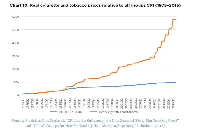
Government's been hiking tobacco taxes. That it would be highly regressive is no surprise. Government restrictions on new building drive housing affordability problems too. Government transfers a lot of money to the poor, but also makes things pretty expensive for that cohort.

I rather like the chart we had in Jenesa's report, Health of the State.


Update: Reader mailbag brings me this rather nice chart from the Stats release. Happy coincidence as the email came in two minutes prior to this morning's 7am queued post.


Informed Reader's conclusion was similar to mine:
The most interesting are beneficiaries. The reason they have higher inflation is:
  • Cigarettes and tobacco that is mostly because of the tax regime
  • Rents whose cost is mostly covered by accommodation supplement and Temporary Additional Support (despite the name it is generally not temporary)
  • Energy that is high because of the policy to subsidise aluminium smelting.
Most of the real difference is down to government. This makes sense if you think about the economics. People with a tighter budget constraint are going to be more price inelastic, so the only place you would see prices rise more for the poor are where prices are not determined by a market.
 Income quintile 1 is more complicated, not least because it includes many people who have income that statistics New Zealand surveys don’t pick up e.g. people starting a business who have “no income”. If you look at Bryan Perry’s work on incomes, you will find he explicitly warns against using lowest decile data. But even here, if you take out the ones for beneficiaries, you are left with property rates from local government and interest which you could reasonably suspect is being paid by those who lenders are prepared to lend money to (e.g. people starting a business who have “no income”...)

Thursday 4 May 2017

Good points on pay equity

Today's reader mailbag brings a few excellent points on the government's pay equity deal for homecare workers.
I think your discussion of pay equity (at least the bit you quote in the blog) does not clearly distinguish between two very different questions: (i) is there an equity issue (ie evidence of discrimination against women)? (ii) is government intervention likely to create more distortions than it solves. One of the reasons I think Hayek is very powerful (cf the "Constitution of Liberty" on anti-trust legislation) by being happy to allow there will be many distortions where real world markets do not deliver efficient outcomes. The force of his argument is that the justification for government intervention has to show how the intervention improves on than outcomes after intervention.

In this context, there is nothing inherent to the way markets operate that will deliver equity and if consumer (or government funding) preferences are racist and sexist, so will the outcomes be. You can demonstrate (as Becker did in the late 1950s) that people make themselves materially worse off by acting in this way, but this is just one of many examples of people trading material welfare to maximise utility (the other obvious ones are giving to charity, voting to pay higher taxes and paying to reduce risk).

But that is not enough to justify government intervention. To justify intervention, it needs to be shown that the outcomes are "better" after the intervention. For instance, if the care industry responds to additional funding by investing in human and physical capital that means many people currently employed in the industry lose their jobs, the outcome may be fairer in the sense of having removed gender inequity for those who are qualified, but have done so by punishing those unable to get qualifications and/or younger people. In fact, you will find in health and social care that occupational licensing has tended to do precisely this, but with a twist that many of the people on lower pay are simply reclassified. So nurses used to do a wide of range tasks. It is no longer worth employing a fully trained nurse to do the lower skilled tasks so "trainees" do some of them and others are done by people explicitly labelled for those lower skilled tasks (e.g. "cleaners").

Therefore my prediction of the impact of the legislation is this:
  • After the initial redistribution there will be a joint effort by health unions and employers to increase the training barriers to be eligible for the higher pay;
  • This will include an extended training period when younger people will be paid at a lower rate because they are "training". Much of the on-the-job component of training will be doing many of the lower skilled tasks previously done by everyone;
  • There will be a plethora of new job titles created, where all will have lower certification requirements than "fully qualified" carers and therefore have lower pay.
  • Most of the people in the lower qualified jobs will be women, earning slightly less than they would previously have earned. They will be disproportionately from poor backgrounds, more likely to be Maori and PI, and will find most practical means of promotion blocked because of the new licensing requirements...
I am not sure that counts as equitable...?
I agree with my correspondent that Becker models under-emphasise that the path to equilibrium can be slow. Taste-based discrimination only really holds up where the customers have a preference for discrimination (unlikely in the homecare case) or where there's a severe lack of competition - and that's the dominant funder problem that MBIE's RIS talked about.  

I fear that my correspondent is right about what comes next. I hope that what comes next is the DHBs shifting to allow more people to hire their carers through MyCare. It's better for the homecare clients and better for the workers and cheaper for the health system. But I'm a bit pessimistic there too - it would require back-end changes that DHBs seem to like throwing into a too-hard basket. 

Wednesday 3 May 2017

Smokin'

I just can't get over the employment figures.

Migration is running hot: huge numbers of incoming workers. Incoming workers take time to find work. At the same time, the government's been pushing pretty hard on work-testing for beneficiaries - and that would have people responding to a labour force survey saying that they're looking for work even if they're not looking all that hard.

And yet, and yet... just look at this. Here's Household Labour Force data going back to 1987, annual March figures. I'm using HLF230AA for anyone wanting to check things in Infoshare.

The top green line is the working age population (age 15-64). That's had a reasonable recent rise mostly due to migration. If there were a lump of labour problem, we'd either have an increase in the number reporting not being in the labour force, or reporting being unemployed.

But that sure hasn't happened. Instead, we've had huge employment growth and actual declines in the number of people reporting being unemployed.

Just look at it. In 1995, there were 700,000 fewer working-aged people in New Zealand than there are in 2017. But there are over 5,000 fewer people reporting being unemployed in 2017.

Or compare it to the overheated mid-2000s. When unemployment was at its lowest ebb, in 2008, there were just under 80,000 unemployed people, 624,000 not in the labour force, and a working-age population of just under 2.8 million.

The 2017 figures have just over 280,000 more working-aged people than 2009 but a total labour force that's almost 300,000 people larger: 18,600 fewer people report not being in the labour force. 248,000 more people in employment. There are just under 51,000 more people reporting being unemployed now than there were then, but the labour force participation rate is 2.6 percentage points higher and the employment rate is 1.3 percentage points higher.

The employment rate among people aged 15-64 is 76.1%. There is no year, going back to 1987, that had it that high. The labour force participation rate for that age group is 80.3% - also the highest in the data going back 30 years. Only minor caveat is that hours worked are growing less quickly, although that wouldn't be surprising either if some shifting into the labour force are picking up part-time rather than full-time work.

We should be shouting from the rooftops about how superbly the New Zealand economy has grown to match the growth in those wanting to be employed here. Whatever your concerns about immigration, dey terk yer jerb shouldn't be one of them.

University reciprocity

Imagine that you and your high school buddy make a deal when you both start restaurants. He and his family can eat for free at your restaurant forever, and vice versa. Fast forward ten years. Your restaurant's better than his, and you're serving his family more than twice as many meals as he's serving yours. Fair deal?

More Kiwis study in Australia than vice-versa, so it shouldn't be surprising that Oz has been getting a bit annoyed with the reciprocal treatment deal. Here's Universities NZ (HT: Dave Guerin):
Universities New Zealand is disappointed by proposed changes by the Australian government that would see New Zealand citizens studying at an Australian university being charged the full-fee rate.

This would break the longstanding reciprocal arrangement between the two countries where students can study in each other’s universities at the domestic fee rate.

We oppose any move that would create a barrier to Australians and New Zealanders studying in each other’s countries.

Currently about 4600 Australian citizens are studying in New Zealand, including 1860 in universities, and over 10,000 New Zealand citizens study in Australian universities.
Australian universities are bigger and have a broader range of offerings, especially once you start getting into graduate studies. The equal-treatment deal would always be pretty likely then to have Australian taxpayers shelling out more to cover Kiwi students than vice-versa.

Rather than get into a huff about unequal treatment and threatening to do things to Australian students studying here, the government might consider offering to just pay the Australians. The government spends thousands of dollars per domestic student studying in New Zealand. Count the number of NZ university students in Australian, net from that the number of Oz university students in NZ, then offer to cut Australia a cheque for something like the NZ domestic tuition subsidy multiplied by the net number of NZ students in Australia.

Update: I've been viewing this entirely in the context of "NZ student moves to Oz for study, and vice-versa". If Oz is instead wanting to impose international student fees on kids who grew up in Oz to NZ parents, and whose parents pay tax in Oz, that's really not on. 

Pay and equity

I went through the government's proposed pay equity legislation in last week's NBR and in The Initiative's Insights newsletter. Some snippets:
The bill would ultimately have the authority decide on allowed wages – the price of labour – if employees brought a claim that they were underpaid.

It requires that remuneration in female-dominated occupations be no less than remuneration in male-dominated occupations with substantially similar skills responsibilities and services, where work is undertaken under substantially similar conditions, and where substantially similar degrees of effort are involved.

But that gets the workings of prices in competitive markets completely backward.

Value and price do not derive simply from the skill involved in some type of labour, or from the working conditions, or from inherent responsibilities. What matters instead is how much consumers value another bit of the final product or service, and how many people are willing to provide the labour to supply it.

If two jobs have, as far as an employment tribunal can tell, equivalent skills, equivalent working conditions and equivalent responsibilities, and one pays far more than the other, that price difference is important.

It says there is a surplus of workers in lower-paid jobs, relative to demand for their services – and a relative shortage in the higher-paid jobs.

For example, translation between Maori and English, or between French and English, may require equivalent skill, training and working conditions but no tribunal could improve on existing market prices to tell you which job should pay more in New Zealand.
I went on to talk a bit about the pay equity mess in Ontario in the 1980s. I hit that part more directly in the Insights column:
The Ontario Tribunal that had to decide on pay equity claims had to choose which professions provided the most appropriate comparison for the group that claimed to be underpaid. The result, as one evaluation later put it, was a “litigation nightmare.”

New Zealand will face similar and substantial problems in assessing which occupations have similar skills and responsibilities, similar working conditions, and require similar levels of effort. While Treasury made the job somewhat easier by providing a hierarchy for selecting appropriate comparators, it would be surprising if New Zealand did not face litigation nightmares of its own.

In short, New Zealand learned little from Ontario’s experience. Neither Tribunals nor Authorities are well placed to set pay relativities between different occupations.
In this coming Friday's Insights column, I'll cover a better way for better pay. If you haven't subscribed already, the sign-up link is at the bottom of the column.

I noted in the column an OIA request of Treasury on their advice regarding pay equity and whether they provided any warnings about the mess that Ontario encountered. Doesn't look like Ontario came up. Here's the first reply, and the rest of the documentation.